Hours of intentional collaboration was definitely the secret sauce here

branding
website
"I was very impressed with how open their communication lines were with us. We were able to brainstorm cohesively as a group and reach our intended goals collaboratively."
— Gita Balakrishnan, Associate Director Of Communications, Editorial
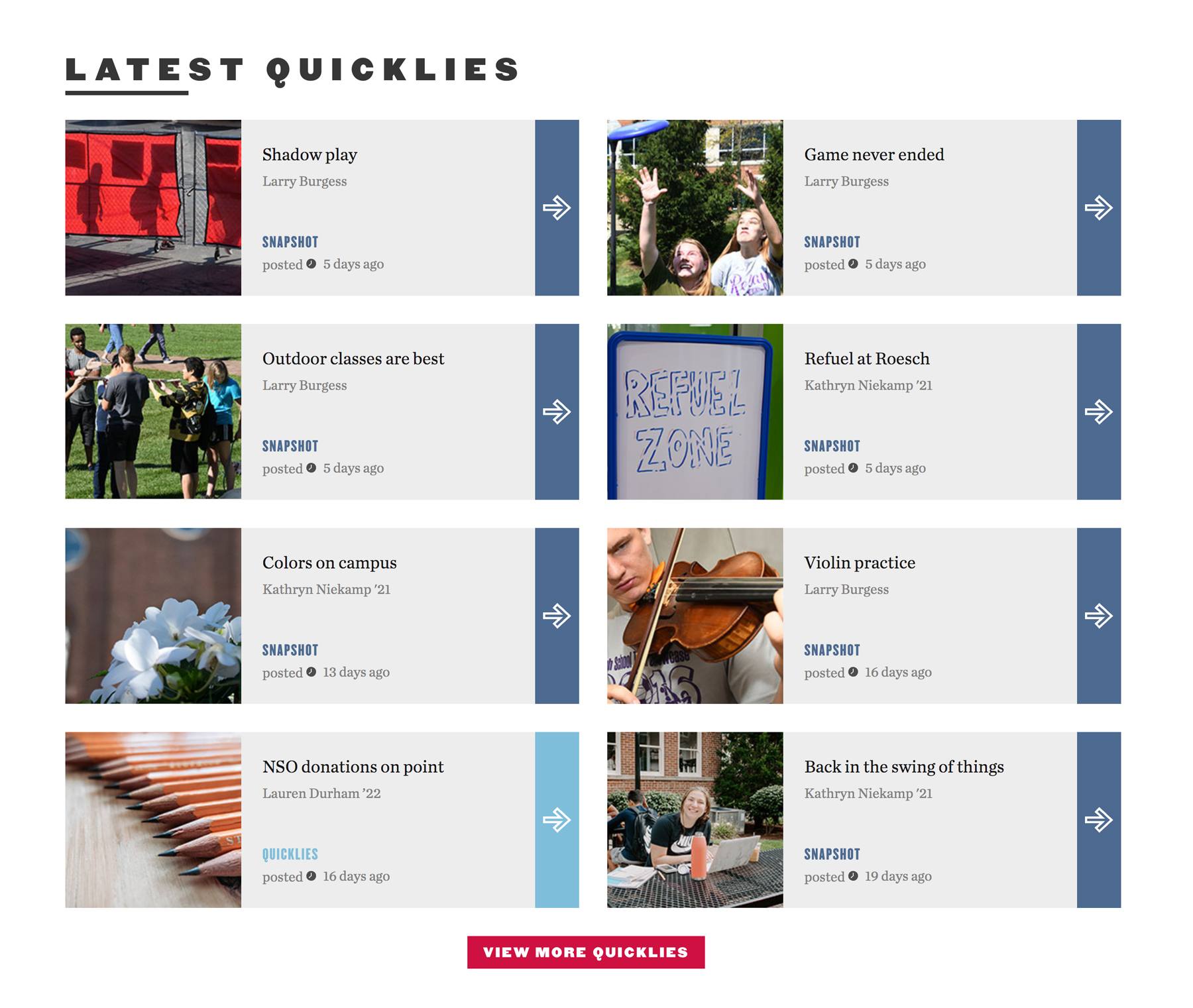
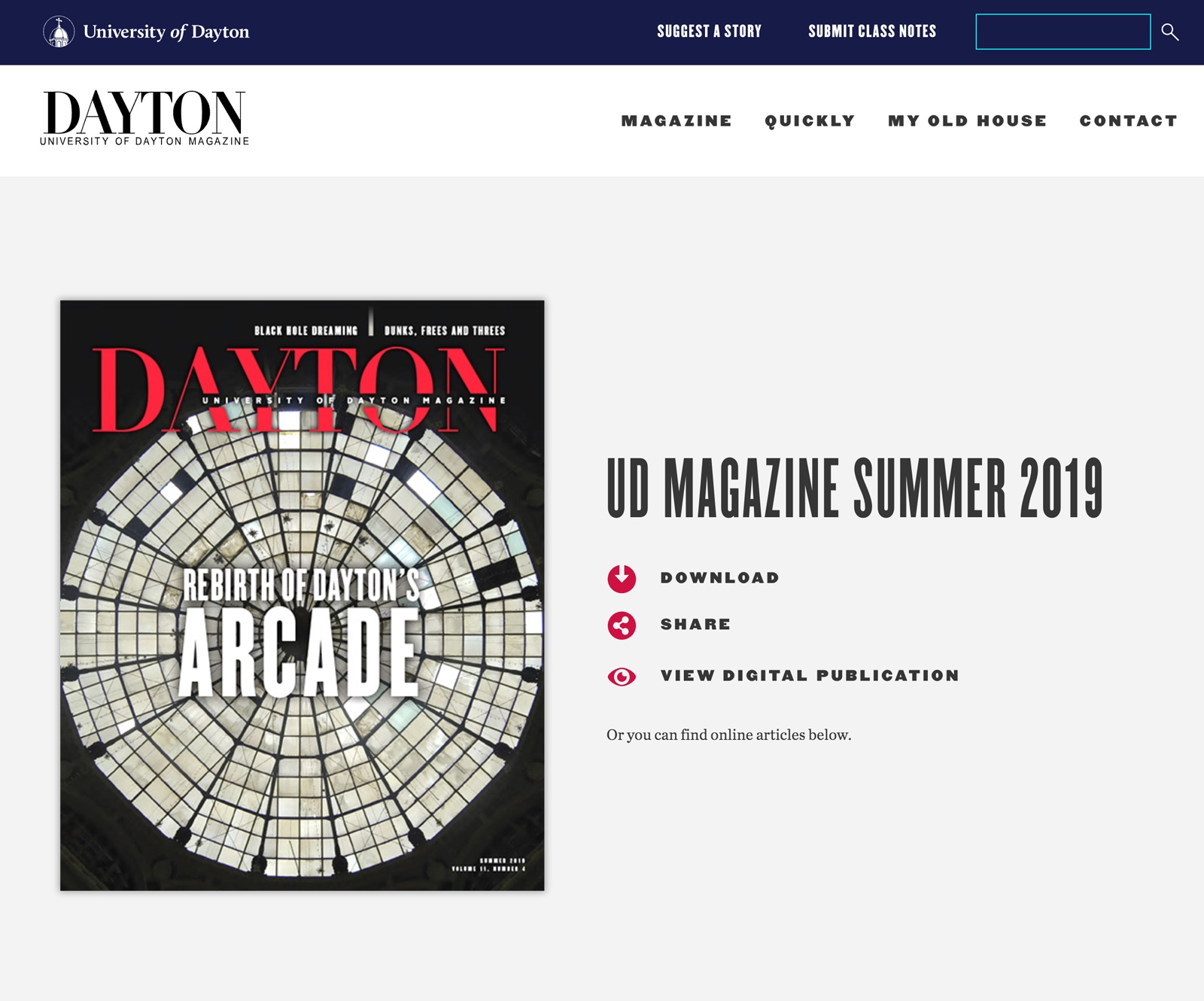
Several years ago we met Michelle Tedford who was leading up a publication, UDQuickly, which was being produced as a magazine from the University of Dayton. We first set out to bring UDQuickly online. We were all happy with the initial results. We continued to support periodic updates and small adjustments, but nothing really major.
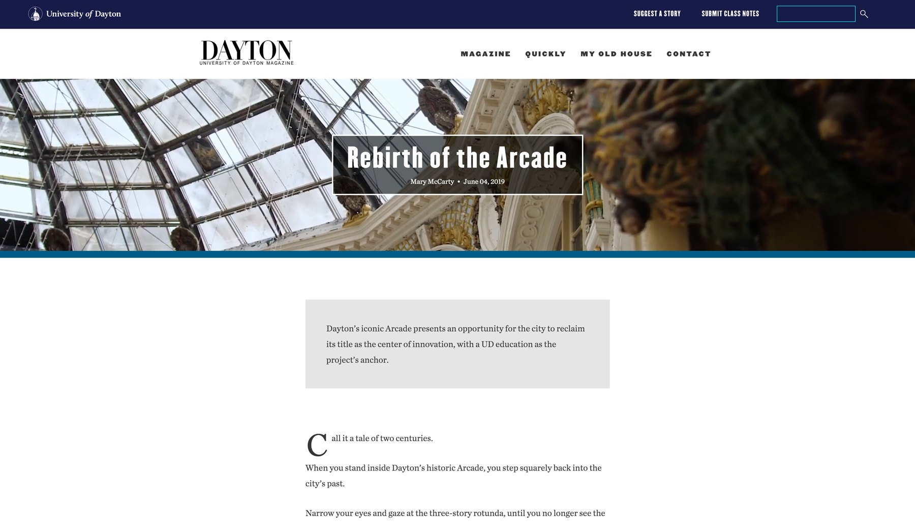
Years later Michelle asked us how could we really enhance their digital experience of the magazine. Oh, did they catch our attention then! The University of Dayton was also going through some brand changes and they wanted to jump on this opportunity to improve the magazine site’s branding as well. We met with them through a series of discovery sessions and research. It was then we got introduced to Gita Balakrishnan, their Associate Director of Communications & Editorial. They came to the table with some solid data and then we added to it with tools like Hotjar and Google Analytics for additional research. Our primary questions:
- How are people finding the information they want to view on the site?
- How is the site engaging people outside of reading one post?
- How are we making the site as simple as possible for people to use?
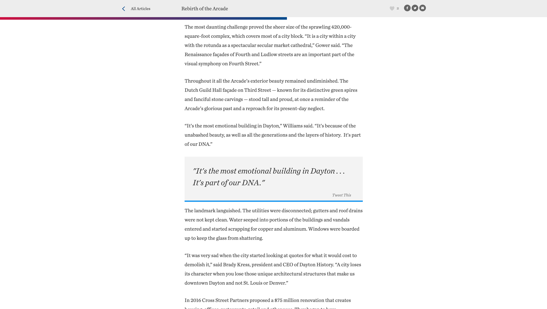
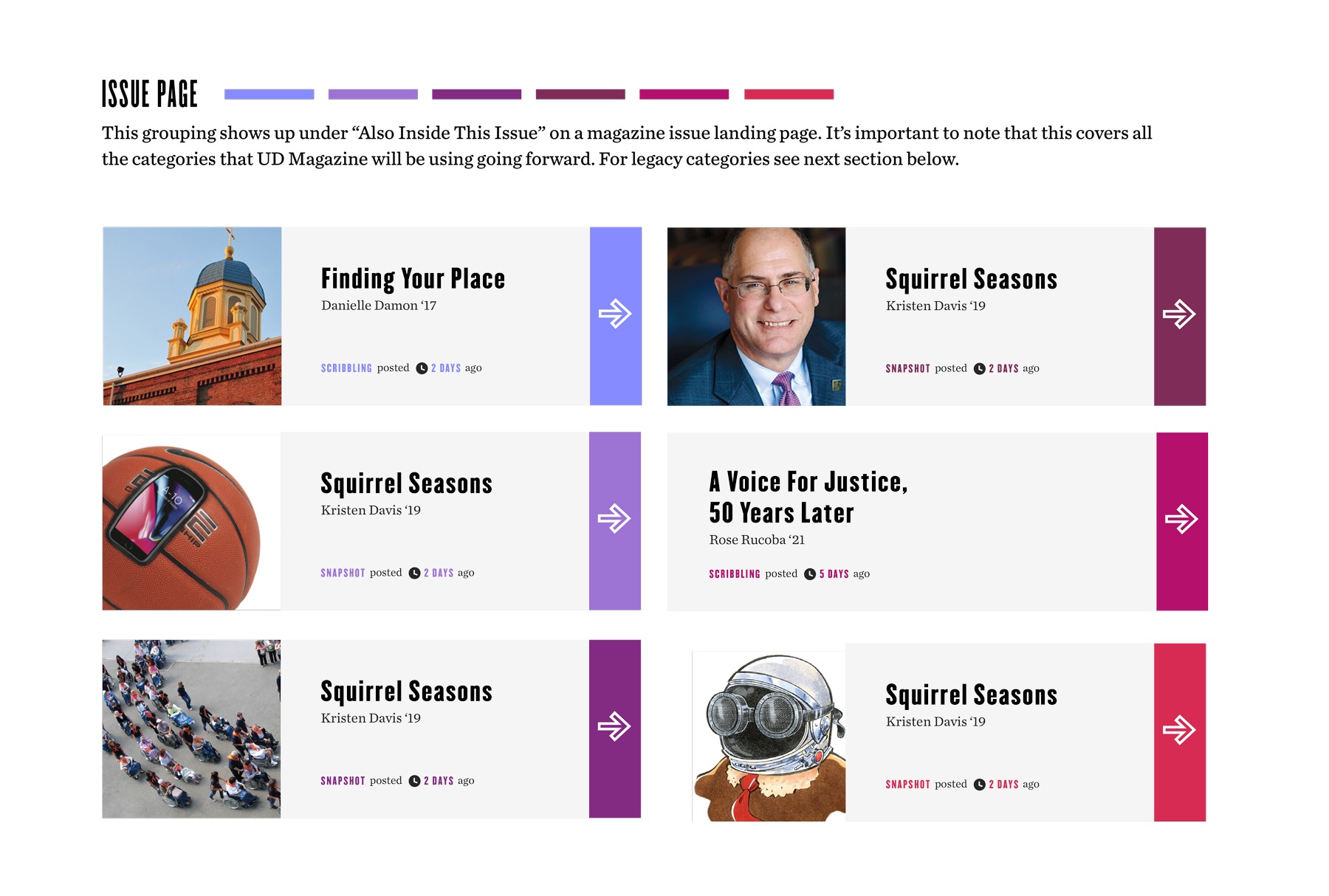
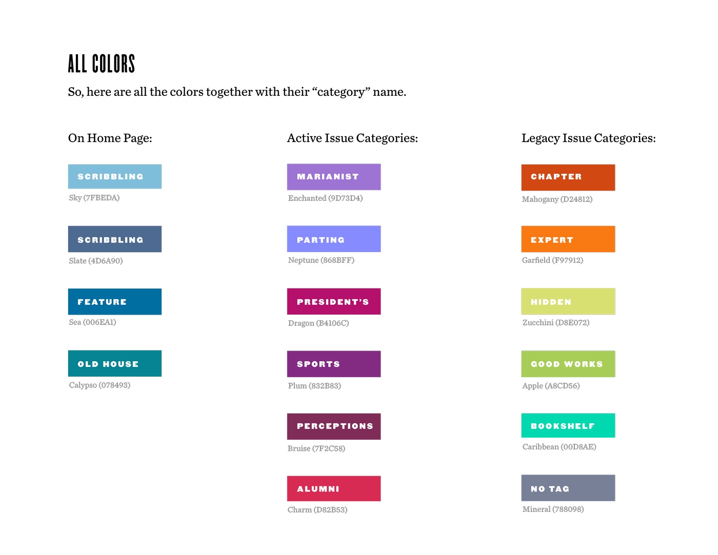
From here we really focused in on the user feedback and data. Things like more intuitive navigation menus and more embedded media in the posts (i.e. video, images, quotes, etc.) came to the top of the list amongst a few others. We had so much fun unpacking each and every item on the site: navigation, article features, design, typography, you name it!
How do you create a brand design system for an online university publication?
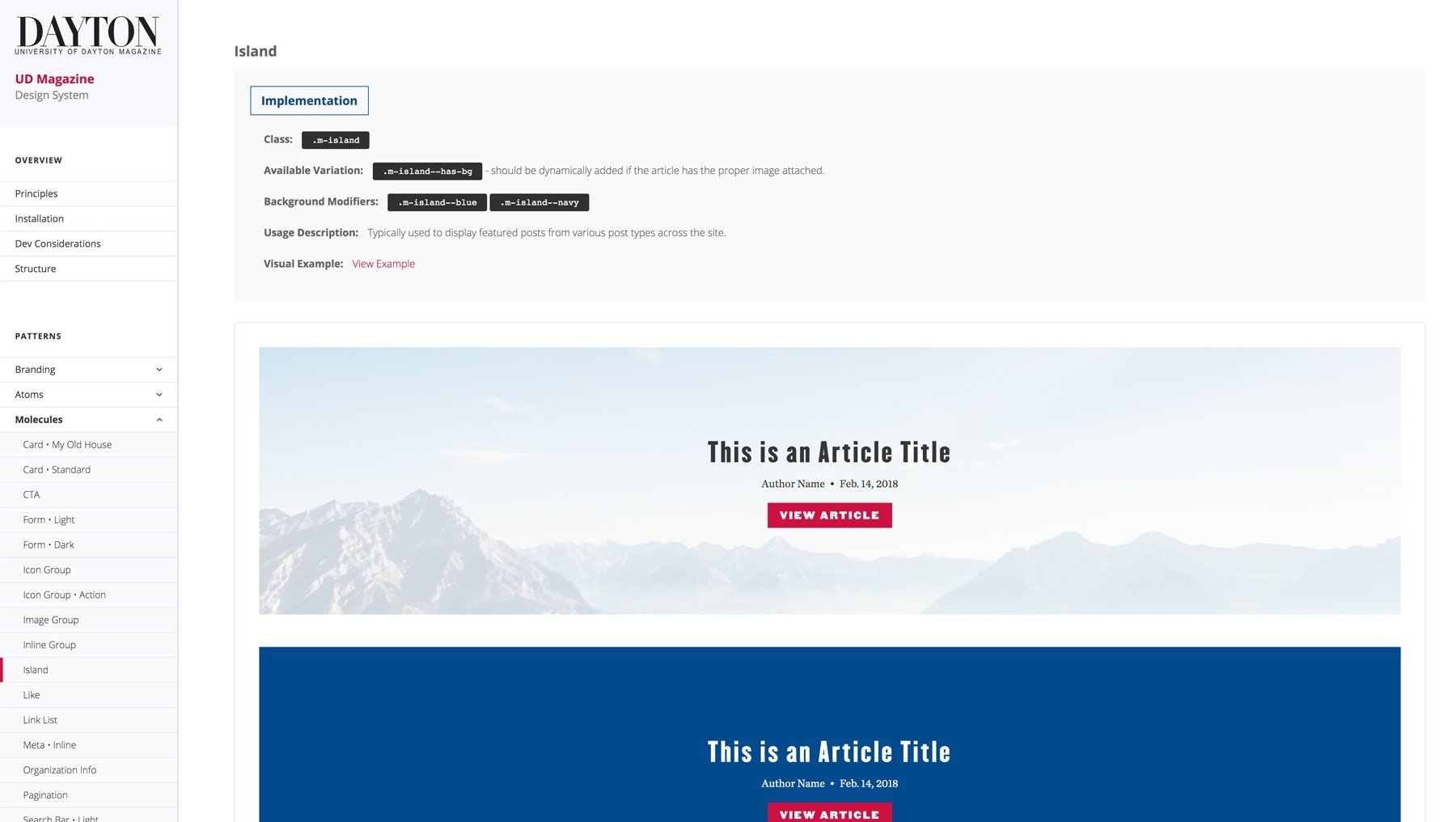
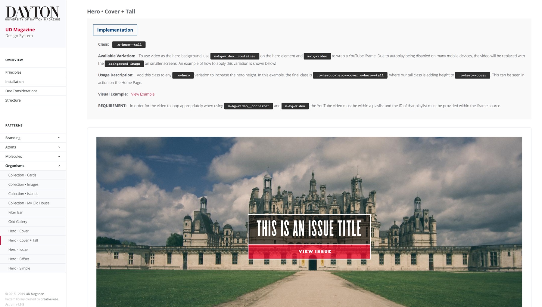
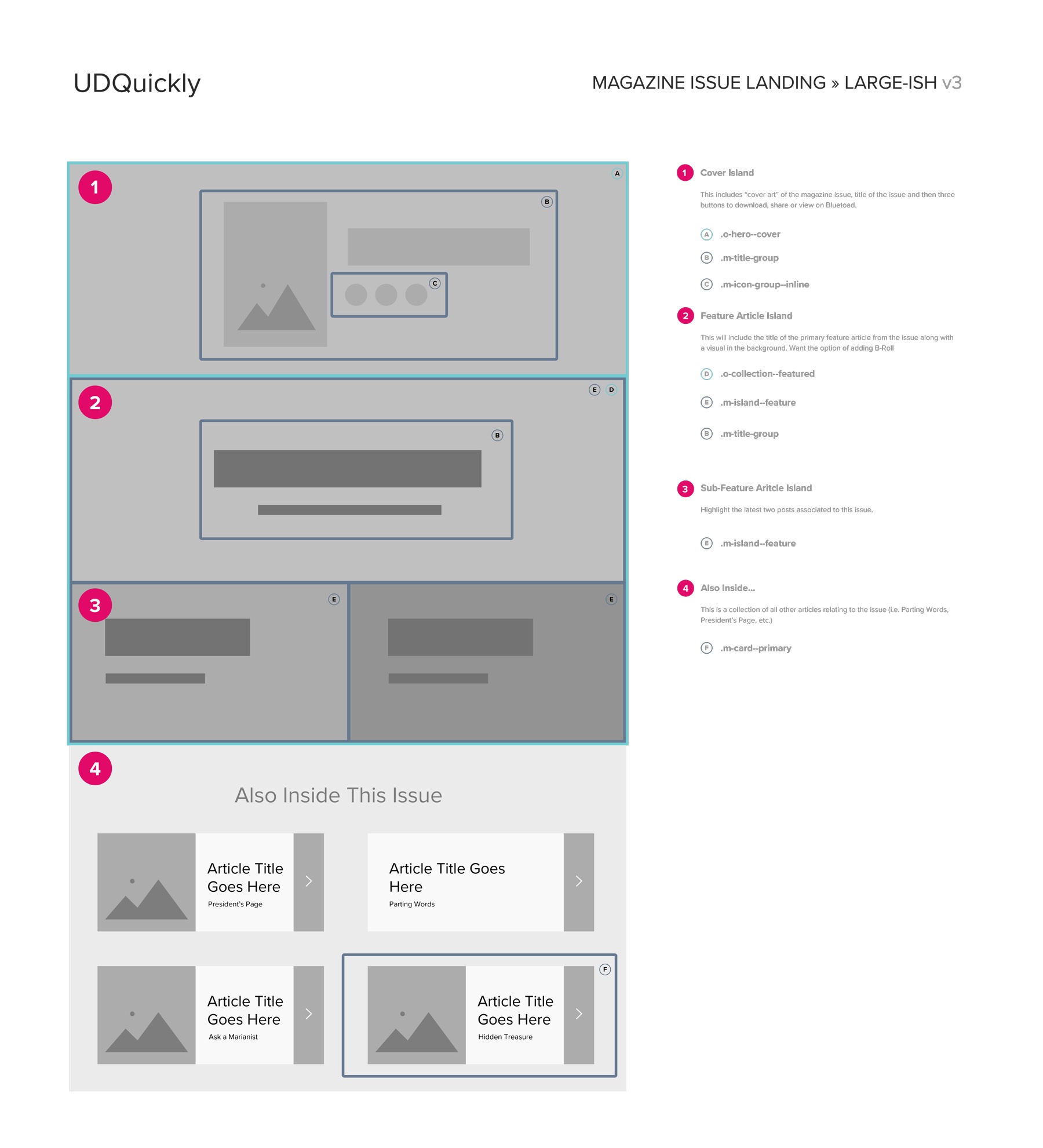
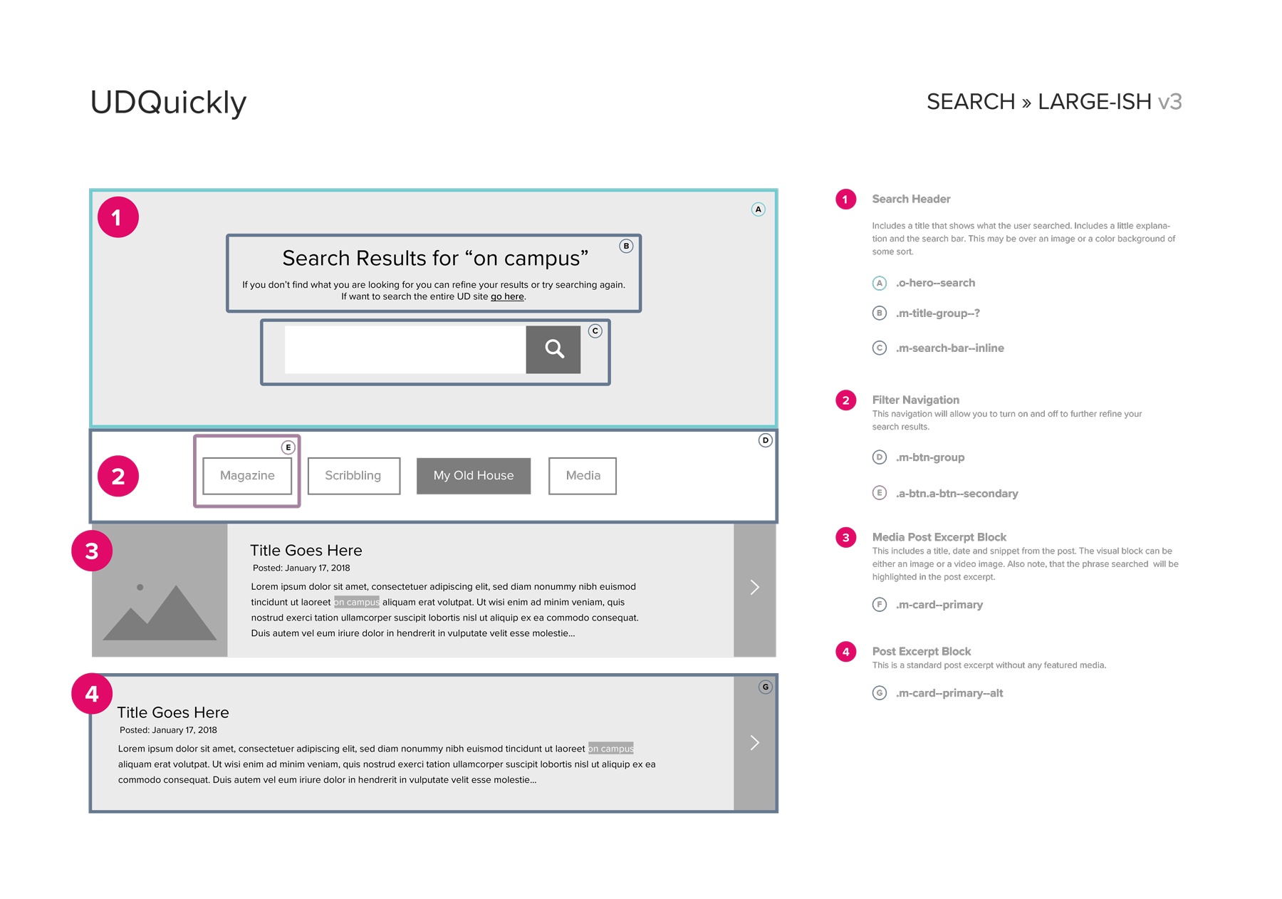
Don’t forget item #2 above. We wanted to encourage more engagement and grow interaction. Things like adding related posts, call-to-actions, share functionality, start a conversation and like/love abilities were all discussed. In addition, this time around, we wanted to dig in with their in-house development team since they were planning to use a specific CMS, Cascade, for the admin of the site. We needed to know its abilities and limitations in order to choose the right path. Darren Elking was our main point-of-contact and we began to discuss how we could ensure what we were building would work smoothly with their system. We had many technical sessions with him and his team early on to determine how best to approach working together. We all landed on creating a design system for the new UD Magazine site. We were thrilled with this approach! This meant that they were planning to maintain the site on-going in order to keep it updated and continue to iterate. And of course, we’re here to assist with new front-end components and features. So feature-by-feature, we began to create components within the system allowing Darren and his team to pull the code and assets needed.
What we enjoyed most was working and collaborating together as a team throughout the entire process. Thank you Michelle, Gita and Darren for the opportunity to do so!
View the website at
View design system at


